

Aggiornato: 19 agosto 2019
In this post, Christopher Frye, a scienza dei dati consultant and Kolabtree freelancer, provides the top open-source data visualization tools that can help you easily visualize and interpret complex data.
Gli strumenti di visualizzazione dei dati aiutano ad ospitare, pulire, elaborare e visualizzare i dati in rapida crescita, vasti e complessi che generiamo e raccogliamo ogni momento. Visualizzazione dei dati facilita i processi decisionali che permettono alle aziende di competere e adattarsi rapidamente agli ambienti che cambiano. Il flusso sempre crescente di flussi di dati in tempo reale e quasi in tempo reale richiede l'uso di cruscotti dinamici, spingendo la domanda di strumenti, piattaforme e applicazioni sofisticate. Le visualizzazioni più efficaci combinano la pulizia dei dati e le tecniche analitiche, e spesso richiedono un data scientist competente. Tuttavia, ci sono una serie di strumenti di visualizzazione dei dati open source che possono aiutare le aziende a visualizzare facilmente i loro dati.
Strumenti di visualizzazione dei dati open source
Ricerca conducted for this post revealed more than 50 data visualization tools that can be considered “open source”. Open source can sometimes generate a bit of confusion as being synonymous with “free”. The definizione più elementare of open source in the context of software is “software with source code that anyone can inspect, modify, and enhance”. Open source data visualization tools require the user to have some programming ability, whereas free visualization tools may not necessarily need the user to have programming ability. Tableau Public is an example of a free data visualization software, however, it is not open source. I have tried to cover some Tableau alternatives in this post.
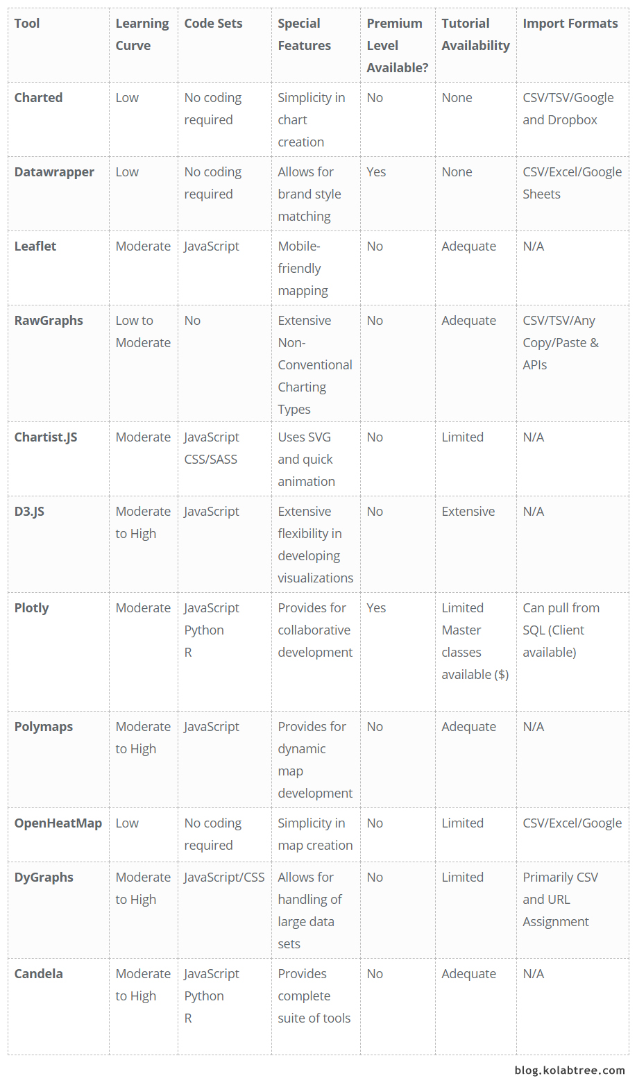
Questo post presenta i profili degli strumenti di visualizzazione dei dati sia gratuiti che open source, e include una matrice di confronto che può essere utilizzata per confrontare e contrastare ogni strumento.
1. Candela
Candela è un pacchetto di visualizzazione dei dati reso disponibile attraverso il Risonante piattaforma. Candela si distingue da altri strumenti perché fornisce una suite completa di componenti per la visualizzazione dei dati. La documentazione di formazione fornisce un avvio rapido per i principianti, mentre il codice può essere utilizzato tramite JavaScript, PitoneL'installazione di Candela a livello locale può essere effettuata tramite l'ultima release pubblica del pacchetto attraverso un repository, anche se la documentazione dello strumento suggerisce di installare il pacchetto dai sorgenti per ottenere l'ultima release di sviluppo.
2. Charted
Charted è forse uno dei più semplici strumenti di visualizzazione dei dati in giro, in quanto richiede semplicemente un link a un file .csv o una posizione di Google Sheets; premi GO e Charted crea una visualizzazione utilizzando un grafico a barre o a linee. Secondo gli sviluppatori di Charted (creato dalla Team di scienza del prodotto a Medium), lo strumento è stato costruito intorno a tre principi: non memorizza i dati, non trasforma i dati, e non è uno strumento di formattazione. Estrae i dati con una cadenza regolare (aggiorna ogni 30 minuti) in modo che le modifiche apportate al foglio sottostante siano sempre aggiornate nel grafico. Supporta anche i file delimitati da tabulazione e i collegamenti a Dropbox. Formazione? Inesistente, anche se non è richiesto.
3. Datawrapper
Datawrapper is a tool that has been in existence since 2011 and is primarily used by journalists, though is comprehensive enough to be useful to any data scientist or researcher. In contrast to most of the tools profiled here, Datawrapper has free and paid versions. It’s also not technically open-source because no coding skills are needed. As the site home page explains, you simply cut & paste, visualize, and publish. Charts are interactive, meaning viewers can see underlying values, and the visualizations can also be embedded on a website. There is a wide range of charting options from simple bar charts to scatter plots, as well as mapping functionality.
In this week’s Weekly Chart, we praise #worldcup visualizzazioni, portare simboli nei dotplot e triplicare i nostri dati per ottenere migliori effetti hover: https://t.co/uZoRwM5R81 pic.twitter.com/RHOYSlAsKL
- Datawrapper (@Datawrapper) 5 luglio 2018
4. Volantino
Leaflet is all about maps. In fact, it has no charting capabilities but touts itself as the “leading open-source JavaScript library for mobile-friendly interactive maps”. The tool provides for a variety of mapping layers, and interaction features such as zoom controls, and mouseover functionality. There is also customization capability such as map projections and easy CSS3 restyling. Additional features can be provided via plugins, and users can vote for additional plug-ins if one is not available. There are both basic tutorials such as a quick start guide as well as more advanced training for plugin development. Install files can be accessed through a repository (both stable and in-progress versions) as well as through source code.
5. RawGraphs
Simile per certi aspetti a Charted e Datawrapper, RawGraphs, il cui slogan è il L'anello mancante tra i fogli di calcolo e le visualizzazioni di dati, simply requires the user to either cut/paste data, upload, or provide a link to create a wide variety of charts. One feature that differentiates RawGraphs is that a number of unconventional visualization models are provided (e.g. sunburst, alluvial diagrams, dendrograms for hierarchical clustering, etc.). Don’t fret, novices – the usual suspects (bar, line, pie, scatter) are also included. For advanced users, new chart types can also be created. Visual creations can be exported as vector or raster images for display on your website, and the tutorials, while not extensive, can be completed quickly so you can get right to work on that visual magnum opus.
6. Chartist.js
Chartist.js è un'altra libreria JavaScript che incarna la sua tagline come Grafici semplici e responsivi. Infatti. Nessuna cascata o boxplot qui, ma ciò che Chartist.js perde in diversità è più che compensato dalla personalizzazione. I fogli di stile (CSS) possono essere personalizzati in grande misura in questo strumento con la personalizzazione che permette l'animazione delle visualizzazioni, alcune utilizzando SVG. Cos'è SVG? SVG è grafica vettoriale scalabileun formato che permette l'interattività e l'animazione, oltre ad essere scalabile (senza perdita di qualità della risoluzione). Chartist.js vede SVG come una tecnologia all'avanguardia, una visione apparentemente condiviso da altri. Ci sono alcuni problemi di compatibilità dei browser, ma il sito fornisce una tabella concisa che indica i browser compatibili.
7. D3.js
D3.js è un'altra libreria JavaScript che sviluppa visualizzazioni di dati attraverso l'uso di html, svg e css. D3 sta per Documenti basati sui dati, document here being a Document Object Model (DOM). The core idea behind D3.js is to leverage the full capability of the modern browser for the development of visualizations through web standards, without “tying yourself to a proprietary framework”. In terms of learning curve, this would be the polar opposite of other cut-and-paste tools, so D3.js is decidedly not for those that avoid the dreaded code moniker. That said, if you are looking for a tool that provides nearly unlimited functionality in terms of design creativity and charting options, D3.js might be just the ticket!
8. Plotly
Plotly’s new #Python interfaccia: rendering veloce di enormi serie di dati, interattivo #Jupyter quaderni, convalida... Questo è enorme! https://t.co/iRzERrUdQX da @jonmmease 👍 pic.twitter.com/VvnGdmgGEk
- Radim Řehůřek (@RadimRehurek) 6 luglio 2018
Plotly is another example of a tool that has both open-source and proprietary (paid) products, each tier containing its own functionality. Offerings can be grouped into two platforms (Plotly On-Premises and Plotly Cloud) with four primary business intelligence tools covering charting, dashboards, slide decks, and SQL client. The SQL client is free, while Plotly libraries are available as open-source through JavaScript, Python, and R. One of the oft-marketed features of Plotly (at least in the paid tools) includes the ability to collaborate and share data visualizations with other team members.
9. Poligrammi
Similar to Leaflet, and as the name suggests, Polymaps is a tool consisting of a JavaScript library for “making dynamic, interactive maps in modern web browsers”. Polymaps is another tool that leverages SVG functionality, facilitating styling through CSS, and allows for increased interactivity. Examples of mapping visualizations include general street layer mapping, chloropleth maps (for instance, comparing state-level data), population density, and even the use of k-means clustering.
10. OpenHeatMaps
Nella categoria di caricamento e creazione, OpenHeatMaps è uno strumento piuttosto semplice che consente all'utente di caricare un file csv, eccellere, or Google Sheets file, and create a map instantly. OpenHeatMap can also be used by developers (as a JQuery plugin) to provide for mapping functionality within their own website. Users uploading a file for rendering are recommended to include a full street address in one field, with values represented in another field (for instance, housing value, sales price, number of employees, etc.). Geographies can be point-based (i.e. one address), or aggregates such as city, county, state, etc.
11. DyGraphs
DyGraphs rivendica come una delle sue caratteristiche principali la capacità di gestire enormi serie di dati, plotting millions of data points without “getting bogged down”. Another feature, for those who consider themselves stats nerds, is the ability to display error bars and/or confidence intervals. To use these, one standard deviation must be specified in the data file. The tutorial demonstrations are fairly basic but should serve to get someone started fairly quickly in creating their own visualizations.
Matrice di confronto

Kolabtree helps businesses worldwide hire freelance scientists and industry experts on demand. Our freelancers have helped companies publish research papers, develop products, analyze data, and more. It only takes a minute to tell us what you need done and get quotes from experts for free.


Unlock Corporate Benefits
• Secure Payment Assistance
• Onboarding Support
• Dedicated Account Manager
Sign up with your professional email to avail special advances offered against purchase orders, seamless multi-channel payments, and extended support for agreements.